Bare Type
Are the clothes coming off, or going on? Either way, this is our new – material – world.

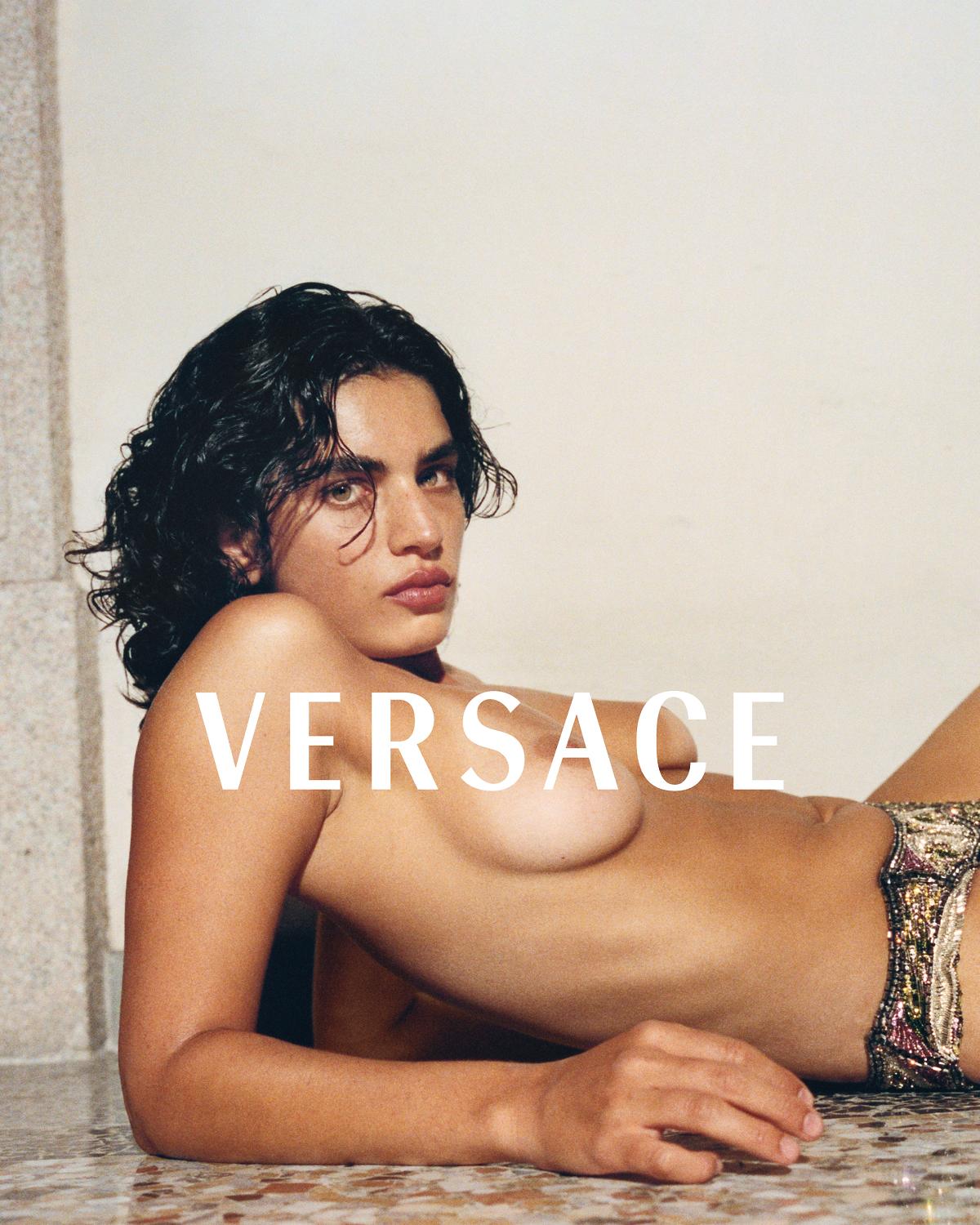
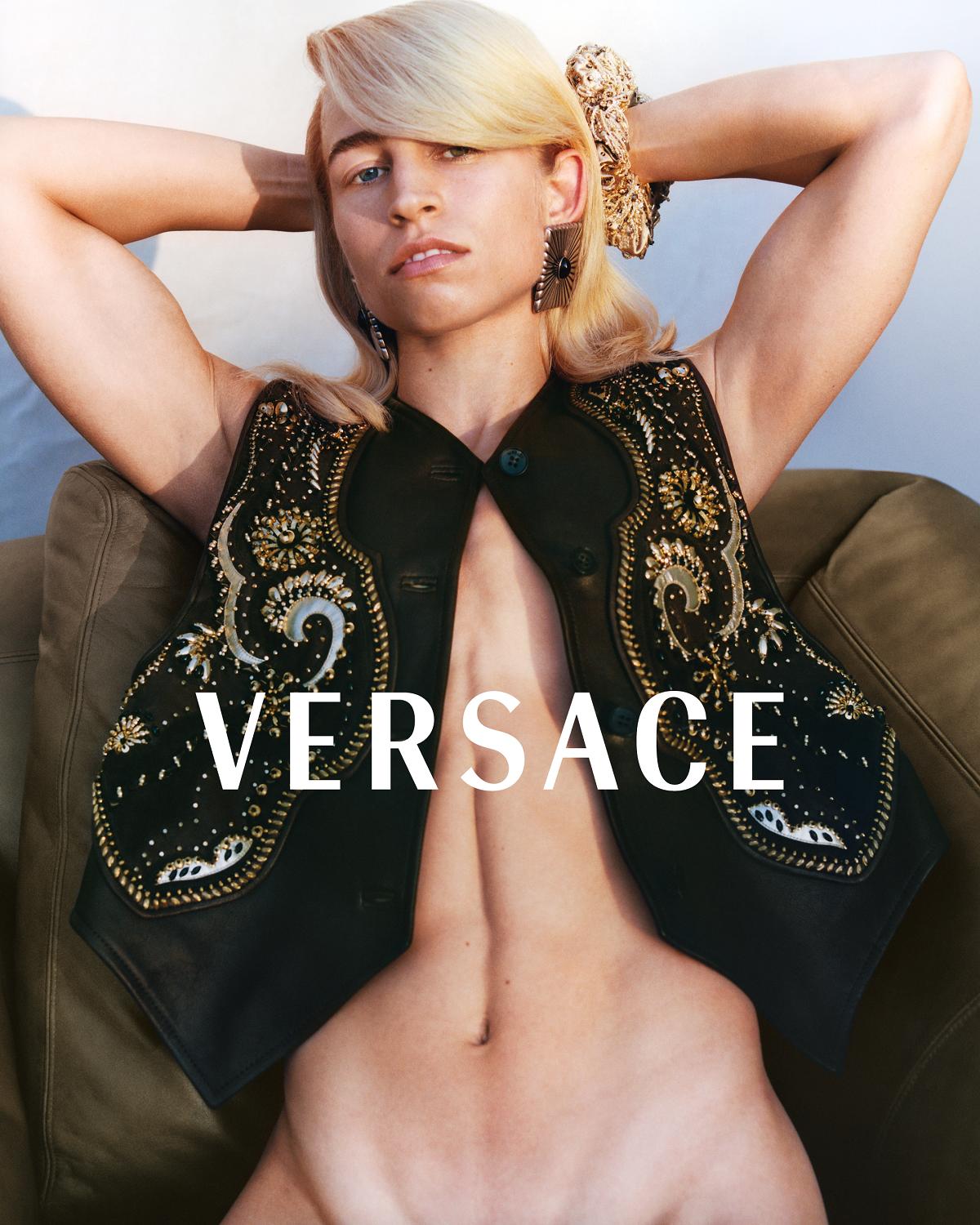
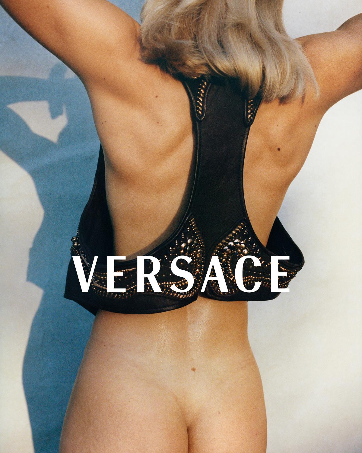
At this time of year when more is more, Versace’s new campaign constitutes a deliberate rupture with some of the trappings of the baroque that have characterised the House in the popular imagination – in particular, its flair for sizzling muscularity and gilded opulence. These latest images, conceived of by designer Dario Vitale and shot by Tyrone Lebon, are more direct than decorative. The lighting is naturalistic. The models – or should we say characters? – are absorbed in a moment rather than serving up glamour. Beauty marks and other so-called imperfections in skin tone distinguish the photographs from the airbrushed hyperreality of the past.

The physicality of the garments – the intricacy of the beading, the weight of the leather – is in evidence too. Are the clothes coming off, or going on? Either way, this is our new – material – world. Interrupting that world, revealing as much as it conceals, is the logotype. In fact, the House has adopted this typeface before. Radiant RR Bold is a sans-serif designed by the Glasgow-born American book designer Robert Hunter Middleton, and in 1990 it took over as the company’s logo, albeit always spelling out the founder’s name in full. When the name of the House was streamlined in 1997, the year of Gianni’s death, Versace appeared curved beneath the Medusa head with its coin-like circular frieze – a constituent part of a complete compositional unit. Then, in 2008, this particular font was phased out.

But now it’s back, as a wordmark, untethered from the Medusa (worry not, she’s present elsewhere – on those heels, for example), and placed so as to cause maximum interruption across the image plane. In its strict, pristine whiteness, it acts almost like a censorship bar, drawing attention to the sensuous allure of that which it obscures. In other words, the typography here is pure sex, and therefore pure Versace.
Credits
Photography by Tyrone Lebon, Milan, September 2025.